Every year, there is a handful of colors that define the season beyond just a trend. In 2025, the color was butter yellow; before that, it was Barbie pink and Brat green. In 2026, things are different – and exciting.
This year is characterized not by a singularly dominant color but by a palette of distinct shades. “Most of us don’t have only one mood,” Xanthe Wells, Vice President of Global Creative at Pinterest told Refinery29. “And the colors for 2026 capture the layers of our lives perfectly.”
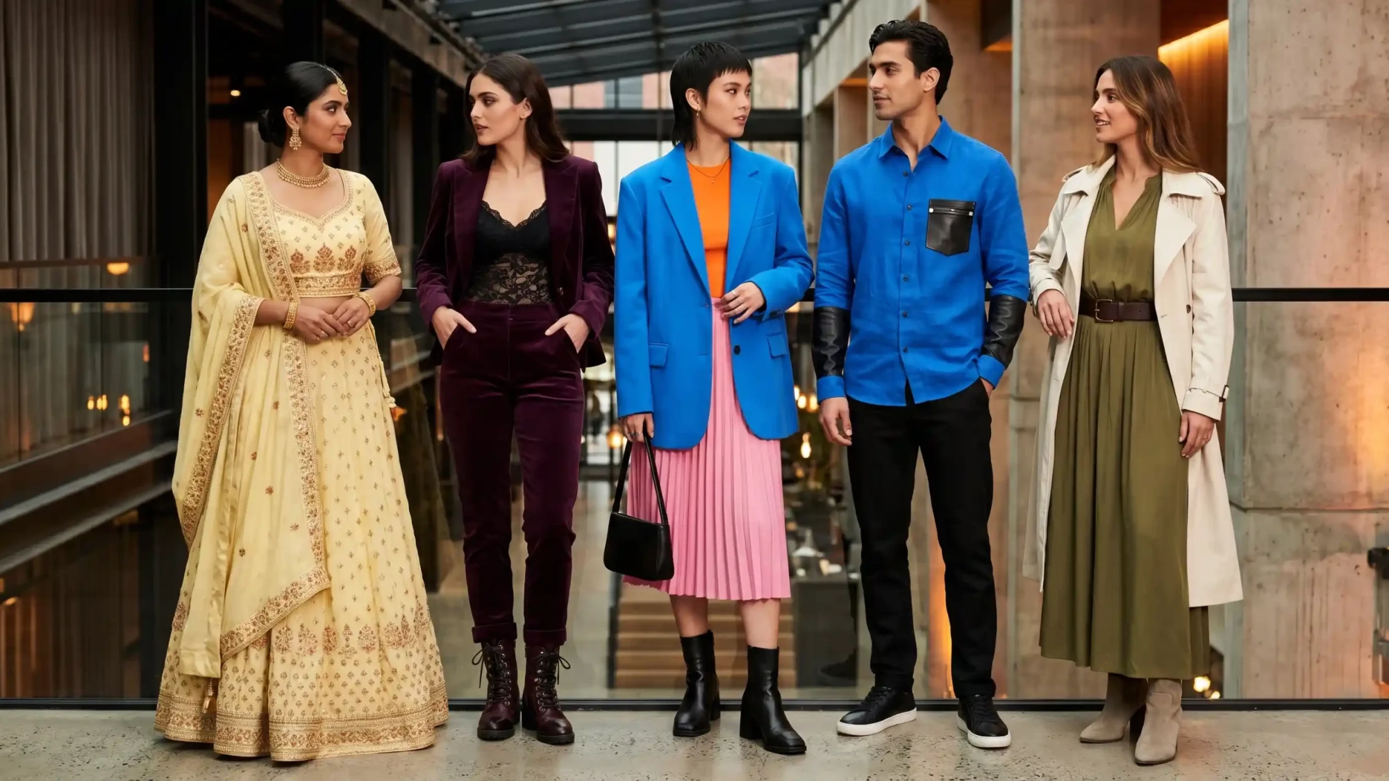
Butter Yellow: The Sequel
Butter yellow wasn’t abandoned by fashionistas in 2025. Instead, it matured. This year, where it used to stand out in statement pieces, butter yellow has evolved into a neutral, paired with white, ivory, pastel grey, and soft brown tones. Butter yellow pairs beautifully with terracotta and gold accents in South Asian fashion.
Cobalt and Electric Blue: The Winning Counter to Neutrals Trend
With every major fashion week and street style season, the color blue is the winning opponent of neutrals trend. Navy blue is a classic. It’s the vivid cobalt, electric blue, and Yves Klein blue we’re dealing with here. At Milan Fashion Week, combos of blue with pink and red were some of the most photographed outfits on the runway. In Paris and New York streets, one of the best looks for summer would be a cobalt blue look complemented by black leather details.
Dark Romance: Plum, Burgundy, and Dark Red
Dark romance was picked up by Refinery29 as one of the signature color stories for 2026, inspired by marketing for the Wuthering Heights movie by Emerald Fennell. Dark plum, dark burgundy, deep oxblood, and dark noir in particular are the shades used in this trend. And the shoes of choice for this trend are definitely boots with buckles, lacings reminiscent of witches’ shoes, and detailed with grommets.
Clashing Bold Colors
For Milan Fashion Week, it wasn’t just bold colors on display, but rather bold colors worn together as color clashes meant to clash but not succeed, yet managing to do so. Orange and pink. Red and blue. Purple and green. According to fashion editors at Who What Wear, the “pencil-box brights” trend that was prevalent in Paris found its full force displayed in Milan, where color clashes became an art form. The method used? Pick one strong color and another complementary or clashing one, put them together in clean lines, and complete the look with black leather accessories.
Across All Shades of Purple
Based on predictions by fashion forecasters Heuritech, we have learned that 2026 will see an onslaught of colors, and purple, in particular, seems to be the prediction that has hit its stride. In an array of variations, from near-burgundies to light luminescent lilacs, purple is being seen everywhere – from New York, Paris, and Milan to South Asia, where it takes on an added spiritual significance for festive dressing. A pastel-purple lehenga with beautiful embroidery is a standout fashion statement in 2026.
Warm Earthy Colors as the Base Palette
Not everything is brassy and bright about 2026. Terracotta, olive, warm beige, dark brown, and pearlescent whites still serve as the base colors for the palette from which all other colors build upon. The bold colors are those that give the added vibrance.
The Practical Color Guide
If you are creating your wardrobe based on 2026’s color theme:
Choose two neutral tones to act as a foundation — ivory + camel, navy + grey, or black + stone. Choose one accent color from the 2026 palette — butter yellow is the safest bet. Choose cobalt blue if you wish to stay contemporary. Choose plum or burgundy for the romantic dark theme. Experiment with one color clash if you wish to experiment — orange and pink are the easiest of clashes, and look good on everyone at any budget level.
Note: bold colors will look best with a simple silhouette.
Leave A Comment